Architect
Rolfe Judd
Developer
Berkeley Homes
East Thames
Contractor
Laing O'Rourke
Planning Authority
London Borough of Southwark
Click any image for a larger view
Tabard Square, behind London Bridge station, has history. The Roman superhighway, Watling Street used to pass close by and preconstruction archaeology unearthed a 1900-year-old marble slab inscribed with the first recorded use of the word Londinium. Some 1300 years had passed before another scribbler began his Canterbury Tales in the streets Tabard Inn this is Southwarks Chaucer Ward.
Then shortly after the second millennium, the site became a record of new era of planning policy. Directions first from central government and then the Mayor to build more intensely saw an initial application for 277 homes rise in a series of new ones to 572 on 1.2 ha as controls on density bowed to the need for more homes, especially more affordable ones. The final consent, built out in March, included a revision in 2004 adding 17 units so that 51 homes could be sold to English Partnerships as key worker accommodation, crucial as the site is close to Guys Hospital.
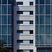
Todays Londoners know where Tabard Square is because a barometer on its tower block, filled with LEDs, changes colour with the weather from red to green to blue. These 22-storeys were redesigned after English Heritage insisted 28 be reduced, in spite of the Mayors support. Towers that get cut back often look clunky. But Tabard Square is a very well resolved residential tower with several bonuses. It is planned as five roughly rectangular plan apartments. But a tower tends to have four sides, which it resolves by interlocking the units and leaving gaps and laps which enliven the facade: more variations, this time in the floor plate provide terraces rather than just balconies at vertiginous heights for larger units at the top; flats have balconies, even shared ownership ones; and the lift cars empty onto halls glazed from floor to ceiling so that arriving on an upper storey brings a shock panorama of both North and South London.This last feature put to shame current schemes which build high but whose views are obscured for the sake of not paying the premium on glass.
The other 3 blocks that form the square have their own surprises, such as the Tabard Street block abutting the tower which has a large Italianate roof garden for residents. An elliptical block on Long Lane benefits from the shape of the elipse as its corridor broadens to follow the elipse, mitigating the impression of its double banking. Floors in this block have been sold to an apartment hotel. This turns out to be a smart way of bringing more intense management to the common parts in the block because the hotels concierge team manage check-in well beyond the hours a normal concierge keeps - or that residents would pay for.
The increase in social housing provision negotiated during the applications for more units gave Southern Housing 212 affordable homes, of which 79 are for rent and 133 for shared ownership. Some shared ownership is in the tower but Southern owns the whole block to the south. Originally designed for market sale, Scheme Development Standards were waived. But much of this block was designed with more affluent residents in mind and newcomers, some transferring from the troubled Heygate estate, now find themselves in apartments with several useable balconies. Ground floor flats opening directly onto Sterry Street are remarkable for high quality stainless steel doors, a feature from the style bible rather than builders merchant. Stainless steel is a common detail throughout, including drip cills, just one indication of attention to maintenance.
Tabards square is the schemes trump card. Its principal three buildings reestablish the lost original street pattern to enclose a new 3675 m2 public space housing a 376 m2 pavilion. One of the largest new squares open to the public in Southwark for decades, it has great benches, large mature trees and high quality surface treatments (including a reproduction of the Roman marble). One side of the square is bound by a large crèche open to new residents and those already in the area, while another is let as a supermarket, part of 2694 m2 commercial. Channels between the three blocks enveloping the square offer sight lines from one to the other to encourage pedestrians making their way to and from London Bridge Station to cut through and they do. So the pavilion will become a cafe restaurant with the guarantee of passing trade.
The square is only open from dawn to midnight and the metal shard sculptures that sit in the channels spin on their axes at night to close off the square, the shards an artful anticlimb finish. Its one element in a clearly considered strategy to maintain control of public realm and common parts, the developer putting in place a well resourced and active management regime. There is talk of the freehold being retained to guarantee no reduction of care going forward. The scheme not only chronicles how planning guidance evolved post PPG3. It is the first major development to strike a balance betwen quality of life and the drive for a compact city.


